
A designer's take on better presentations
Pablo Monteoliva·updated Jun 2025
As a designer, I see too many decks doing too much. Too much text, too many charts, too many effects. The message gets buried, and the people you're trying to convince tune out.
Over the years, I've helped founders raise millions by designing their pitch and commercial decks. After meetings, it's common to hear: "Who designed your slides?" That's how many clients end up working with us.
So here's the simple system I use to help teams build better decks. Clear, focused, and built to support the person speaking.
Designing for presenting, not for reading
Before we start, let's make something clear. This is about presentation decks, the kind you show live or send as a recording, with you talking through it.
If you're not presenting and just sending the file for someone to read, then it's not really a presentation. What you need is a written doc that tells the full story without you there. Memos or public notes work better for that because they give full context, unlike slides.
That's the distinction, now let's talk about how to design the kind of slides you actually present.
Why a good deck matters
A strong deck doesn't just look good. It helps you communicate clearly and be remembered. Here's why it makes a real difference:
- Clarity wins attention. People tune out when slides are messy or overloaded. Clear slides keep your audience focused on what you're saying.
- It reflects how you think. A well-structured deck shows that your thinking is clear and organized. That builds trust.
- It helps you tell the story. Good slides support your narrative and guide the audience through your key points, one step at a time.
- It shows respect for your audience. Clean, readable slides make your message easier to follow and process.
- It improves outcomes. Whether you're pitching, reporting, or teaching, better slides lead to better conversations and decisions.
Build a simple structure
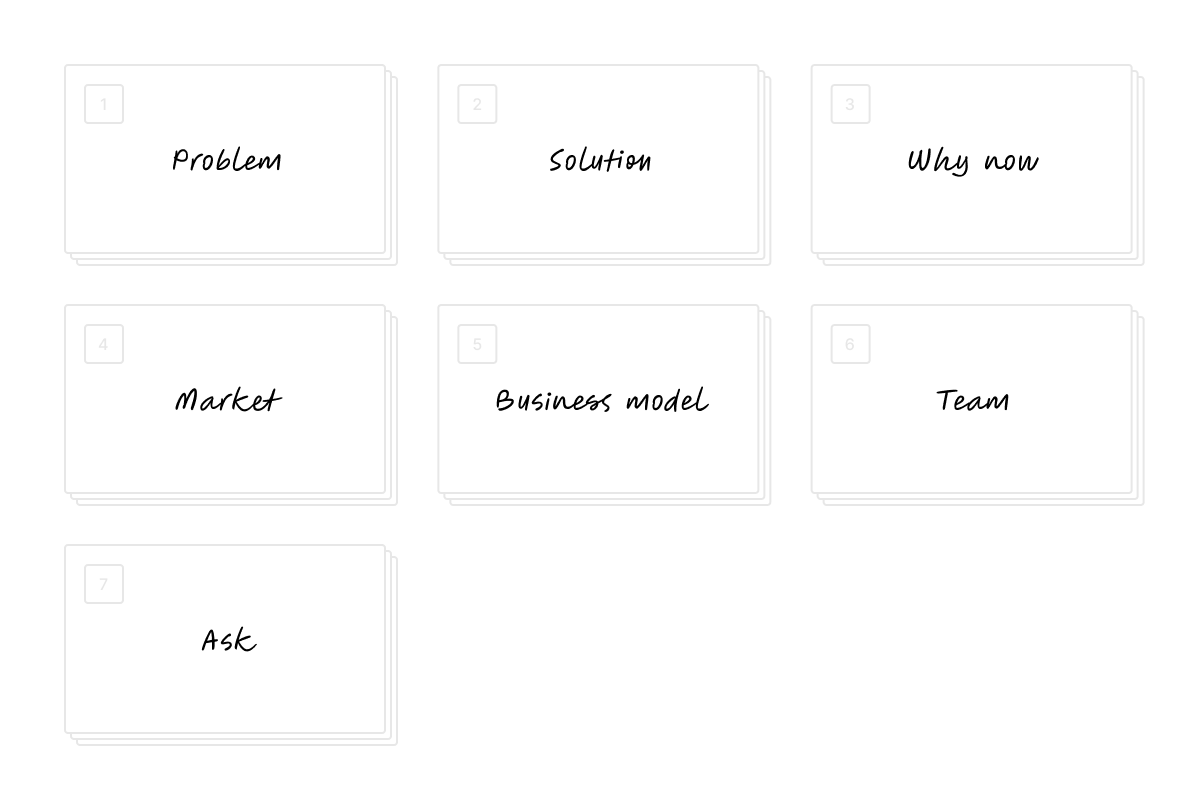
Don't overcomplicate it. A good deck follows one clear flow, depending on what you're presenting. For example this could be a foundational flow for a fundraising / pitch deck:
One idea per slide
The "10-slide rule" is a myth. What matters is the type of deck you're building. If you're presenting live (or sending a recording), the number of slides doesn't matter. A 10-minute talk can have 10 slides or 100. The important thing is flow and clarity.
When presenting:
One idea, one headline, and visuals. Per slide.
The goal is to reduce cognitive load. When you show one clear idea per slide, people can process what they see while listening to you. They are not splitting attention between reading and following your message.
And sometimes, the best slide is no slide at all.
A blank slide can be powerful. It puts the focus back on you, creates a pause, resets the pace, and gives your audience time to absorb the message.
Make it easy to read
Make it easy to read at a glance. Use big text. A simple rule: your main message should take up most of the slide. Think of the top 2 or 3 lines stretching close to full width. Subtext can be smaller, but it still needs to be readable, even from far away or on a phone screen.
Keep lines short and leave plenty of space around the text. Simple always works better than small and dense.
Stick to your brand fonts. If that's not possible, choose a system font that feels close. Big text helps the main message land at a glance, even on mobile or from a distance.
Using color
Use a clean background. White or black usually works best. If you want to add visual elements, stay within your brand. The more colors or layers you add, the harder it is to keep things clear and make the slide hold together visually.
Animations that serve the story
Use animation to support the story, not to decorate. If the point is clear without it, skip it. Movement should make something easier to understand. If it doesn't, keep it still. Subtle transitions are usually enough.
If you follow these basics, you're already way ahead. That's the starting point.
When I work with founders, we go further. We fine-tune the story, polish the design, and make sure every slide does its job. But even before that, getting the fundamentals right makes a huge difference.